7 practical tips for optimizing authorization on the site
How do authorization and registration on the site affect the leading indicators of the online store? How do you motivate users to create an account? In this article, you will find practical advice from a UX/UI expert on designing and optimizing the process so that it is as convenient and fast as possible for the user and brings income to the online store.
1. Autofocus on the first field
Ironically, the fundamental rule of interaction design is: Eliminate interaction. Remove clicks, remove reading, remove waiting, remove thinking.
A simple example: 95% of people who open the registration form immediately click on the first field; spare them this action and automatically focus on it.

2. Use dedicated mobile keyboards
The only thing you can be sure of in this life is (a) death and (b) email addresses containing the characters "@" and. "." Luckily, mobile phones have specialized email keyboards that display these characters, but you must specify this in the HTML type=email. This elementary change will make life easier for mobile users.
Note: This also applies to phone numbers (type=tel), URLs (type=url) and numbers (type=num) during the registration process.

3. Check fields immediately
Don't wait for the user to complete the entire form to point out possible errors. Report bugs as soon as your system detects them. For an email field, it makes sense to check for blur (that is, when the focus is set to another area).
I usually try to capture blank and misspelled email fields.

4. Make Labels Interactive
Any text input field must have clickable labels. Surprisingly, this is not done in HTML by default. Just add an input element inside the corresponding label element. It not only (a) allows me to click on the label to start typing but (b) also helps me if I accidentally miss the text field a little.

5. Show password requirements when users create one
No user should have to guess what the password requirements are. Show them when they're relevant (P.S. And delete them when they're not needed).

6. Allow users to display the password
Allow users to view the entered password. It will prevent acute UX issues with choosing a password while being less demanding than requiring you to enter it twice.
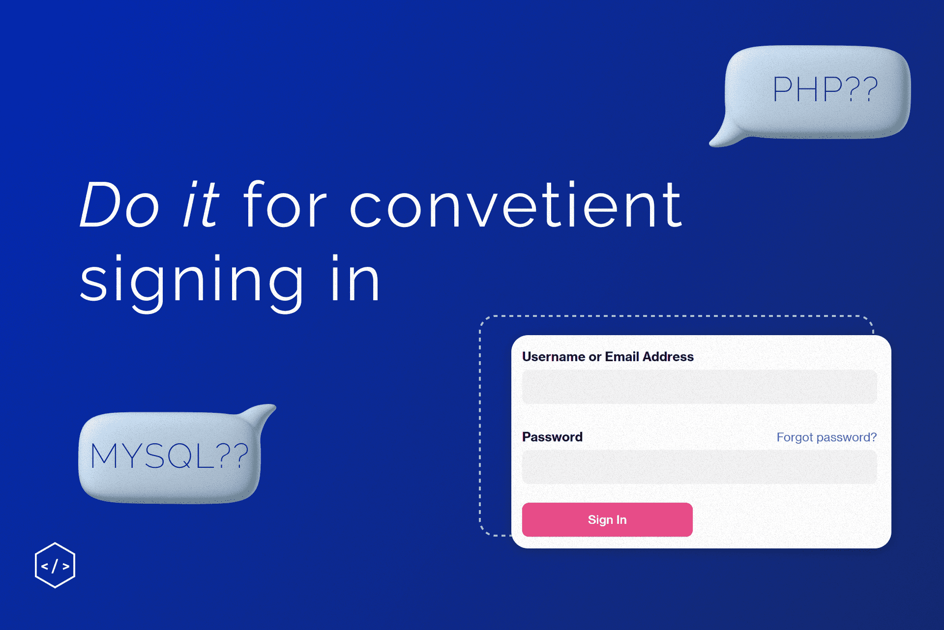
Learn more: How to create User Login with PHP and MySQL?
(That said, the last method is still much better than nothing.)

7. Allow SSO
Why force users to choose another username and password to work with our little service? What if we let them use their existing username and password? For example, a Gmail or Twitter account!
Crazy, right?
But that's precisely what we can do only if you have no particular reason not to.
(Now sites need to remind users when they have already selected this option)

Remember: no one comes to your app to log in. Unless your app is meant to be fun, most users will probably want to use it to achieve a particular goal as quickly as possible and then get on with their lives.
Learn more: How do we optimize the checkout process so that visitors do not leave?
And we talked about how to register users on Magento 2 in a free course. You will learn how to log in and log out users with the help of PHP and MySQL.