4 online stores with the stunning web design
What happens when people land on a site with broken links, lots of ads, and difficult navigation? They leave the platform forever.
Therefore, web design is the first component of attracting the attention of the user.
It's not just about aesthetics. The site should be completely intuitive, and easy for every visitor. First of all, they pay attention to the practicality of use and ease of obtaining information, and then to the number of pictures.
Principles of a good design
- It answers the question "Who are you?", "What do you do?", and "What the user can get here?". If you are the owner of Coca-Cola, then you do not need to introduce yourself. But since this is not the case, then let the user immediately understand where he got to.
- Good design calls to action. Design should make the user stay on the website. Keep everything concise: the faster the visitor receives answers, the faster he will develop an incentive to use the product.
- It's optimized. Each page should be easy to use, and key navigation elements arealways visible. Moreover, in the 21st century, the entire site must be optimized for reading on smartphones.
- It is dynamic. A static home page gets boring quickly. Some elements should be changed with some frequency. It is best to rely on the wishes of users in this regard trying to make the best product for them.
Apple
When it comes to web design, it is impossible not to mention the company that has achieved maximum success in marketing. Apple products are recognizable around the world. Their quality played the main role in this. But the annual presentations and website design also draw attention.
The message on the home page is minimal: the name of the product and its price as well as the most necessary links: ordering, searching for a store, and studying the product in more detail. The navigation bar also lets you jump to search for specific gadgets.
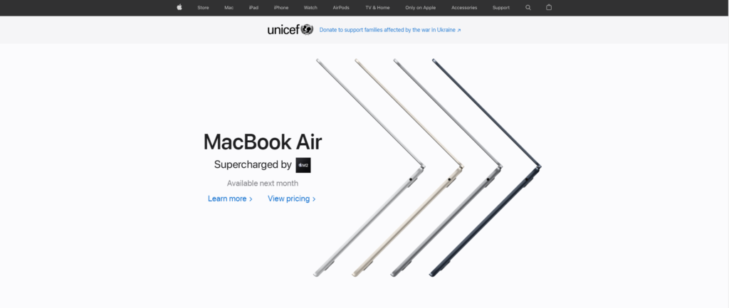
The description of each product is also fully consistent with the style of the company. They highlight every detail only with slogans that reflect the functionality of the products.
On average, you need to spend no more than 2 minutes getting detailed information about any product or service. At the end of each description, a call to action is a purchase of the product.
If a person who knows nothing about the current world was allowed to explore the Apple website, he would be interested in the products. Perhaps the purchase would follow immediately.
Carmax
Looking at the website, you can immediately understand that this is a platform for selling cars. But the developers are clearly faced with a unique problem: the company sells and buys vehicles. Therefore, the Carmax home page had to be oriented to 2 categories of users at once.
The first thing that catches your eye is the yellow area, which calls for action (both for selling and buying). The second is a concise slogan that explains the essence of the site. The third is a car search string with the necessary filters.
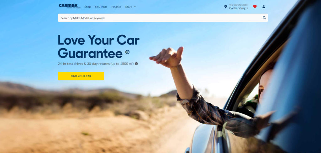
These 3 components are what the user needs when he works with such a site. There is no need to look for something: everything is in front of your eyes. Scrolling the page provides answers to primary questions, such as the features of the service or the bidding procedure. As a bonus, research on the best cars has been added.
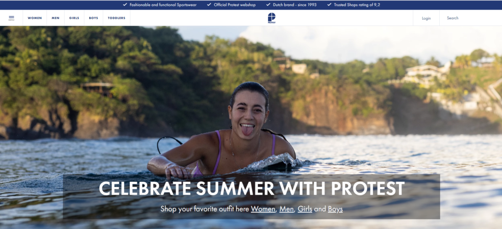
Protest Sportswear
Online stores are required to work out the web design to the ideal. After all, the competition in this area today is incalculable. After all, many brands supply high-quality clothes today. But it is more pleasant to buy it in 5 minutes than in 15.
Protest Sportswear always changes the design according to the season. Until the winter is over, they offer the consumer to prepare for the next snow adventure. The brightly and stylishly dressed hero on the picture only attracts additional attention.
The navigation bar has clear sections based on the clothes the user needs. Page transitions are organized as slides, so there is no need to look at a white screen during loading, even for one second.
The desire to buy something is formed from two indicators: appearance and cost. Therefore, all products are arranged in the form of pictures with price tags. All additional information can be found by going to the page with a specific product.
It takes a couple of minutes to order, since all actions are arranged sequentially, in an intuitive order. The selection may take several hours. It does not depend on the site but on the preferences of the buyer.
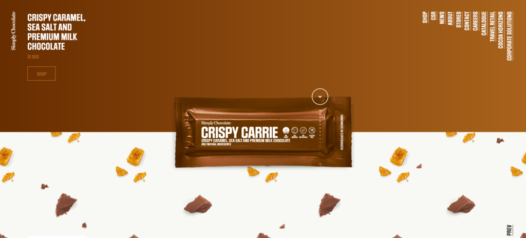
Simply Chocolate
This is an online chocolate bar store. It would seem that nothing should be changed here as almost any website could envy its interactivity.
There are not many goods, therefore there are no sections. However, you will be introduced to each of the bars better than any consultant can do it in the store.
Each bar is highlighted with its own color. To get acquainted with the composition, you need to click on the edge of the candy wrapper. When you go to the next page, the animation of opening the candy wrapper will be displayed. At the end of the scroll, a piece will be broken for you, thereby urging you to try chocolate.
Tradition is important in website development, but good web design doesn't require a strict formula. As you can see, every site has common elements, regardless of its specifics. But each of them is markedly different from the other.
Create, don't copy. Come up with the best design for your target audience. Tell about your product by highlighting its unique qualities.
By doing this, you can create a site that everyone will look for to review and one day it will get a similar rating.
Was it useful? Share with friends and colleagues!